4 CHATEAU REVENGE! - The Silver Seas
"What's The Drawback?"
"Another Bad Night's Sleep"
3 FATHER, SON, HOLY GHOST - Girls
"Vomit"
"Alex"
2 DAYS - Real Estate
"It's Real"
"Green Aisles" (live)
1 THE ENGLISH RIVIERA - Metronomy
"The Bay"
"The Look"
"Everything Goes My Way" (featuring Roxanne Clifford)

My comics: Bad Machinery - Scary Go Round - Giant Days :: My Shop :: My Flickr Sketchblog :: My Last.fm
Friday, December 30, 2011
Thursday, December 29, 2011
Albums of the year 2011 8-5
8 ZONOSCOPE - Cut Copy
"Need You Now"
7 TRUE LOVES - Hooray For Earth
"True Loves"
"True Loves (Cereal Spiller Remix)"
6 50 WORDS FOR SNOW - Kate Bush
"Wild Man"
5 STARTING FROM NOW - Heidecker & Wood
"Right To The Minute"
"Life On The Road"
"Need You Now"
7 TRUE LOVES - Hooray For Earth
"True Loves"
"True Loves (Cereal Spiller Remix)"
6 50 WORDS FOR SNOW - Kate Bush
"Wild Man"
5 STARTING FROM NOW - Heidecker & Wood
"Right To The Minute"
"Life On The Road"
Wednesday, December 28, 2011
Albums of the year 2011 12-9
12 DIAPER ISLAND - Chad VanGaalen
"Peace Is On The Rise"
11 LAST SUMMER - Eleanor Friedberger
"My Mistakes"
10 HOTEL SHAMPOO - Gruff Rhys
"Sensations In The Dark"
9 PARALLAX - Atlas Sound
"Amplifiers"
"Terra Incognita"
"Peace Is On The Rise"
11 LAST SUMMER - Eleanor Friedberger
"My Mistakes"
10 HOTEL SHAMPOO - Gruff Rhys
"Sensations In The Dark"
9 PARALLAX - Atlas Sound
"Amplifiers"
"Terra Incognita"
Tuesday, December 27, 2011
2011 Albums of the year 16-13
16 UNDERNEATH THE PINE - Toro Y Moi
"New Beat"
15 UNKNOWN MORTAL ORCHESTRA - Unknown Mortal Orchestra
"How Can U Luv Me"
14 GLOSS DROP - Battles
"Ice Cream" (NSFW)
"My Machines" (feat Gary Numan)
13 TRAGEDY - Julia Holter
"Goddess Eyes"
"New Beat"
15 UNKNOWN MORTAL ORCHESTRA - Unknown Mortal Orchestra
"How Can U Luv Me"
14 GLOSS DROP - Battles
"Ice Cream" (NSFW)
"My Machines" (feat Gary Numan)
13 TRAGEDY - Julia Holter
"Goddess Eyes"
Monday, December 26, 2011
2011 Albums of the year 20-17
20 THE KING IS DEAD - The Decemberists
"Down By The Water" (Live On Jimmy Kimmel)
19 VERONICA FALLS - Veronica Falls
"Bad Feeling"
18 WELCOME TO CONDALE - Summer Camp
"Down"
"Better Off Without You"
17 MIRROR TRAFFIC - Stephen Malkmus and the Jicks
"Senator"
"Down By The Water" (Live On Jimmy Kimmel)
19 VERONICA FALLS - Veronica Falls
"Bad Feeling"
18 WELCOME TO CONDALE - Summer Camp
"Down"
"Better Off Without You"
17 MIRROR TRAFFIC - Stephen Malkmus and the Jicks
"Senator"
Tuesday, December 20, 2011
An unmissable treat.
This year as last year, Lunge Dolphin has emerged to put a Jesustide smile on my face - and yours! Check his mood.
Lunge Christmas 2011 from Eclectic Schlock on Vimeo.
Tuesday, November 29, 2011
Come get drawn tomorrow, by me, at Cornerhouse Sketchomatic
MANCHESTER, UK ALERT
I will be working the portrait booth for Sketch-O-Matic at the Cornerhouse on Oxford Road tomorrow (Nov 30th) from 1-2pm. I draw you, £1. Details here!
I will be working the portrait booth for Sketch-O-Matic at the Cornerhouse on Oxford Road tomorrow (Nov 30th) from 1-2pm. I draw you, £1. Details here!
Monday, November 21, 2011
scarygoround.com site issues
Some readers have been getting a generic (and gross) holding page rather than the usual Scary Go Round website today. From what I can work out, the domain name for one of my nameservers (the backup) lapsed so what you're seeing is some kind of spontaneously generated holding page. I don't think the DNS has been hacked, I haven't lost control of the site, or any of the other horrible things I thought might have happened this morning.
I have requested the necessary changes to fix this, so hopefully it will be sorted in the next couple of days. If you've not been able to see today's comic, have a look here.
I have requested the necessary changes to fix this, so hopefully it will be sorted in the next couple of days. If you've not been able to see today's comic, have a look here.
Thursday, November 17, 2011
Mr J. Allison at Leeds Thought Bubble Festival

Are you in the north of England? Then why not come and see me this weekend at Leeds Thought Bubble Festival. It's at the Royal Armouries, and I am assured that the venue will be "rammed with intrigue" and "spoiled for talent". For the first time, the show is running across two days and I will be there all day Sunday too.
I will be on a panel, "Comics Economics", from 14:30 – 15:20, in the Alea Casino Cinema Room. Come down, hoot and holler that I am "da best". Demand the hits!
I'll have the following items, many of which you can't get on the site.
* Some show-only limited Bad Machinery collections of The Case Of The Lonely One and The Case Of The Simple Soul
* A few Scary Go Round / Giant Days / Ghosts books
* Meat Means Dinner Aprons
* Knitting Is Zen totes
* A variety of limited prints, A4 and A5 size
* Stickers!!!
* The last few tea-towels
* Postcard sketches (depending how busy I am, I may do larger drawings - probably only on Sunday, but do ask if you're interested)
* Other assorted gewgaws and curios
* RAW LOVE FOR FANS / ANSWERS TO THE QUESTIONS THAT PLAGUE YOU
I really hope to see some of you there, this is my favourite UK show - it gets better every year.
Monday, October 10, 2011
Cold, Dead Fingers Dept
Much ink has been wasted on whether music as a predominantly digital format has cost us something precious, and wonderful, and irreplaceable, and why can't I stop crying &c. There have probably been losses and gains. No song ever need vanish from the catalogue, no treasure need be buried unheard, deleted. Physical formats become fun and worthwhile when produced, rather than drably essential. There need never be another CD released with a single page in the jewel case, another exercise in "why did we bother".
Sure, there's too much music to ever listen to it all, but that's like having too much dinner and remembering with a warm glow the cold hard certainty of rationing. I miss the excitement of the record shop, but not the excitement of discovering something new.
But I don't feel the same way about ebooks. I hate them. I genuinely hate them. With music, your relationship is predominantly with what is going in your ear. Yes, you may stare at the cover for Tales From Topographic Oceans by Yes for half an hour while going on a prog journey, but that really is making your own fun at its most innocent, deny that if you like.
The relationship with a book is very different. It's a tactile object relatively unchanged since the Gutenberg press. You've got to hold that thing in front of your face. It's your buddy until you're done with it. A well-thumbed, much read book is like a vile, beloved, drooled on childhood bunny, but you wouldn't buy one of those second-hand unless you had a lot of problems in your life.
Now I sell ebooks, of course I do, because people want them, and while I am sentimental, I am not mental. And I can shove in 50 extra pages that I found down the back of the sofa because it costs very little to do so. Did I think those pages were worth publishing the first time? No. There's something wrong at the heart of that, like the height of the CD era, when filling the disc to the full 74 minutes became paramount. Bloat over art.
I've seen examples of the beautiful work being done in interactive ebooks for children. They depress me. Kids are in a world of their own and we seek ever more to make concrete things that would have lived in their imagination. Any graphic work is dead on screen compared to how it looks on paper.
This is the first time I've felt like this. I love digital media. They free us from clutter, from waste. But I don't think we have to be beholden to gadget manufacturers on books. I don't think we need to enter the dismal Kindle's annual upgrade curve. Books aren't a delivery medium, they're an art form. We forget that at our peril.
Tuesday, September 27, 2011
The Beatles
Today heralds the US release of Kate Beaton's "Hark A Vagrant" through the auspices of Drawn & Quarterly and I commend it to you. Kate has been a friend and an inspiration since 2007. Her work has a lightness of touch and an infectiousness that makes it easy to ape but almost impossible to originate - anyone who has witnessed her brutal creative process can attest to that.
Kate's Mystery Solving Teens and Bad Machinery originated on the same day, in the same car, from the same teen-based event! I doubt I have achieved with 400 pages what she has managed in the minds of readers with ten. Now she's not perfect. Don't ever let her touch anything you own if you like its current, unspoiled condition. But if you want to follow Agent Dale Cooper's advice and "give yourself a present every day", here's todays.

Kate's Mystery Solving Teens and Bad Machinery originated on the same day, in the same car, from the same teen-based event! I doubt I have achieved with 400 pages what she has managed in the minds of readers with ten. Now she's not perfect. Don't ever let her touch anything you own if you like its current, unspoiled condition. But if you want to follow Agent Dale Cooper's advice and "give yourself a present every day", here's todays.
Tuesday, September 06, 2011
Blame The Sky cover process post
I haven't blogged much lately but I thought this might make a nice little process post. Here's the process for working on the new cover for Blame The Sky, which I just added to my e-book shop. If you like e-books, why not buy it? It can't hurt, can it?
Here's my original sketch, which I did with a ball point pen while cooking some rice. It didn't take very long.


Here's my original sketch, which I did with a ball point pen while cooking some rice. It didn't take very long.

I then began to painstaking trace my original in Illustrator. Flaws in the original sketch soon become evident when you add solid colours .

Once I was done tracing, I refined and juggled around shapes until people looked like they were meant to. Tessa and Rachel are characters I've hardly drawn in the last five years, so I had to do a bit of revision in order to capture their attitude. Amy was easy. Apart from how she barely looks like she did then at all.

Here's the new cover next to the original. The original was never very good. I was capable of a lot better even back then, but I didn't know how to lay out an effective cover so I would often do something rather stiff-looking, just to get it done.

Despite hardly drawing anything in Illustrator since 2006, I can produce a far nicer illustration from it now than I ever could back then. It's a great program to produce a sharp-looking drawing from, but fresh hell to work in day-in, day out if you want to produce organic looking comics.
Sunday, July 10, 2011
Birmingham Sketch Party
I was lucky enough to be sitting between Joe List and Kristyna Baczynski at Birmingham Zine Fair, and there are few people more able to reduce me to paroxysms of helpless mirth than those two. Any summer blues were blown askew by this kindly two. A lot of ideas hit paper, and I am able to post some highlights below. Prepare for a feast!
In the first picture I illustrated the point that what I am looking for in a girlfriend is "a really high forehead". Then, below, Joe List and Mr Dan Berry explore their love of CSI. At the bottom, Kristyna and I go "sales mad" with explosive and largely unproductive fervour


In the first picture I illustrated the point that what I am looking for in a girlfriend is "a really high forehead". Then, below, Joe List and Mr Dan Berry explore their love of CSI. At the bottom, Kristyna and I go "sales mad" with explosive and largely unproductive fervour
With love and marriage now firmly on the agenda, Ms Baczynski and I played a game of "Couples", where each artist has to draw half of a romance and the other creates a suitable mate. What followed was, by turns, beautiful and unutterably vile.
Meanwhile, Joe had drawn on a large number of Post-Its, in the hunt for the ultimate idea. And below, together we created a Blind Date/Dating Game style trio of suitorettes for me. Tina Warbucks has the nightmarishly high forehead that I called for, Tessa Terabyte has glamour and plenty of external storage, while Polly Clock is sweet-natured and extremely punctual, with a kind of moving facial timepiece tattoo. Lorra lorra!
The choice... is yours (MINE).
Wednesday, July 06, 2011
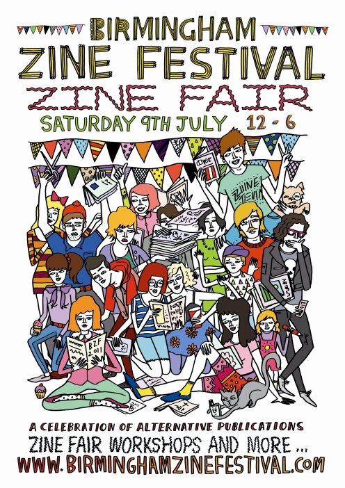
Birmingham Zine Festival
If you live in the middle of England, why not come down to Birmingham Zine Festival on Saturday July 9th, where I will be selling books, doing sketches, and attempting to raise the nation's spirits. It's a free event! I'll be sharing a table with my friend and ally Kristyna Baczynski, whose work is a stone cold treat for the eyes and mind.
It's at the We Are Birmingham shop on King's Parade, very near New Street and Moor Street stations, here's a map! I hope to see you there.

It's at the We Are Birmingham shop on King's Parade, very near New Street and Moor Street stations, here's a map! I hope to see you there.
Tuesday, June 21, 2011
Jack Cole's instant cartooning course
I've found Jack Cole's Instant Cartooning Course very useful on numerous occasions. It helped me a lot with hands (it shows you how to understand and get hands right with a pentagon-based system) and swiftly demystifies heads in profile.

Jack Cole was the creator of Plastic Man, he also produced many beautiful painted pictures for the then-newly launched Playboy. I took the scan above from "Jack Cole and Plastic Man" by Art Spiegelman and Chip Kidd, a fascinating overview of his often crazed, dynamic work.
Here is the text from the course - it's probably better just to buy the book but there are so many gems in here that it would be daft not to include it.
Monday, June 13, 2011
Simon Reynolds on "decor for life"
This is from the current issue of The Wire magazine. Simon Reynolds' latest book, Retromania, came out very recently and I look forward to cracking it soon.
'Underground', in 2011, means creating an atmosphere of cultural intimacy. So the most apt comparison for where do-it-yourself music is today might be Etsy, the online market for handmade and vintage items. Not only is the economic structure similar — small entrepreneurs selling their wares at fairs or through specialist boutiques but doing most of their business online — but the aesthetic sensibility overlaps. There are the same vintage materials and formats (T-shirts with pictures of old-fashioned typewriters, notepads that repurpose the covers of 1970s textbooks), the same penchant for slow unwieldy production methods, even similar iconography (lots of Etsy stationery features animals and birds, particularly owls!)
But what this analogy leads onto is the unsettling thought that underground music making is becoming a niche market, a form of hip(ster) consumerism that slots right next to distressed furniture, microbrew beer, artisanal cheese and vintage clothing. No longer art as an intervention in the battlefield of culture, but art as 'décor for life'.
I agree with Simon to a greater extent. The two questions I ask are:
1. Have uncertain times, in concert with lives led online where there is little reliable constancy, led people to embrace comforting, often infantile tropes?
2. Were the culture wars over when ever greater media divergence (across all platforms) meant that the great, abstract "water cooler moment" disappeared and one could simply ignore the culture you didn't like? Have most of the guns simply been put away?
Thursday, June 09, 2011
Charlotte

Charlotte is a fun character to draw and one of my favourites to write. One of the hardest things about making Bad Machinery is drawing characters who are growing up on the page. I have to run all their parallel developments in my head at once, try to keep them in proportion and on-model, at a time when the once-trustworthy human body starts rebelling in 100 confusing ways. Lottie is perhaps the easiest because I can look at her sister Sarah in Scary Go Round, and her mother, I know where this road is probably going to end.
Wednesday, June 08, 2011
Please stop me thinking
At what point do outsourcing of labour and automation of repetitive jobs (particularly client-facing) begin to undermine business beyond the point where outsourcing (thereby lowering prices) and automation (lowering employee cost) can make up the shortfall? What happens to global capitalism when you make more than a certain portion of the workforce redundant because they simply aren't needed?
My initial guess is that perfecting human pyramids will become a lot more popular.

My initial guess is that perfecting human pyramids will become a lot more popular.

Tuesday, June 07, 2011
This self deprecation has to stop
On more occasions than I care to count, someone has come up to me at a comic show, pressed their little photocopied effort into my hand, and said "it's not very good". And 49 times out of 50, I manage to stop myself saying "then why on earth should I read it".
If you've taken the time to draw something, and photocopy it or have it printed, and travel to a destination, and give your work unsolicited to a complete stranger, try not to make this oft-repeated faux pas at the final moment. Your work may not be of a professional standard, it may be loose, "sophomoric", poorly lettered, imperfect - it may be flat out rotten - but you finished something, and if you finished one thing, you can finish another, and you will improve.
Here is the rub. There are people at every comic show I attend producing work that I can only describe as execrable, who stand with consummate pride next to their rotten pamphlet and sell it to all-comers - with an astonishing degree of success. Now, I know that it comes down to character. Those people are probably psychopaths.
Self-criticism is a valid exercise and a vital component of improvement. But it is not an attractive attribute to strangers. Wrestle your terrors alone in a windowless room under an unshaded bulb, with a loaded pistol and a jam jar of potent "prison screech" on the table.
Out and about, on the scene, I want to see you beaming with pride that you made it out of that room with all your teeth and most of your sensibilities intact.
ADDENDUM: If you approach me with a comic called "Sh1tty Comics", "My Crap Comics", "Cavalcade Of Rubbish", "The Underperformance Chronicles", "Awful Tales" &c, I will tear it up in front of you or shred it upon my return home.
Monday, May 30, 2011
T-shirts on the internet
Here are the 10 categories of successful tshirts on the internet
1. Pop culture recognition humour / copyright violation
2. Self-affirming message
3. Acknowledgement of under-represented group
4. Acknowledgement of under-represented pastime
5. An extremely "clever" image
6. A sensational piece of easily "gettable" wordplay
7. Unexpired meme
8. Food and drink
9. Come-on / invitation to a come-on
10. Juxtaposition/combination of items 1-9
Every time I broke these rules, I ended up with a lot of leftover shirts.
The ultimate non-expiring meme is "cats". You're welcome.
Thursday, May 26, 2011
Here's what I'll be doing at MCM Expo
I'm exhibiting at MCM Expo in London this weekend, and it's a funny old show. So I have a new feature: GO MANGA. Perhaps there are some clues to what I am up to in the image below:

Pick three cards at random and I will draw you as an ultimate manga king or queen based on those three characteristics. If anyone wants to add to my list of three-word-max criteria, please feel free to add your suggestion in the comments. So far I have:
Robot armour
Wings
Stupid cute sidekick
Weird eye thing
Huge boots
Totally dreamy
Big hair
Oversized dangerous weapon
Air of mystery
I'll have a couple of books for sale and some stickers and badges, but this time I'm here to meet people and draw. So please come and say hello!
Tuesday, May 24, 2011
Fear Of Failure
Iconic designer Milton Glaser (of "I Heart NY" fame) on "fear of failure", professionalism and experimentation. Whatever your field, I think you can learn something from this sage seven minutes.
Milton Glaser – on the fear of failure. from Berghs' Exhibition '11 on Vimeo.
Monday, May 23, 2011
Giant Days Redux
I really enjoyed working on this week's Giant Days comics. They were complex to make, more difficult layouts that I had tried before. Most of them are like two of my normal comics in one - the first things I've done that I'd want to print at an A4 size rather than the smaller size that I usually work at.
I had intended to draw them all like the test comics I posted last week, but half way through the second one, I started to feel like I could give them a bit more polish and make them really nice. Below is the first one I did in pencil - and here's the version I actually ran. I like both, but the subsequent pages needed more than I could give them in this rougher style. Difficult to explain!

Incidentally, I came up with the pencil-and-photoshop method as a way of saving time. By the time I'd done a couple of them, I had gobbled up almost all that time filling in lovely ragged looking brick walls. There is also a measure of extra care required when laying out panels. Add in scanning, putting on proper panel borders, and clean-up, and the savings were negligible.
Though working on Giant Days made me want to do a proper, longer, story, returning to Bad Machinery straight away has felt right, straight away. I love the characters and of all my projects , it's the one that feels like it has the most gas in the tank. I hope you'll enjoy The Case Of The Lonely One.
Wednesday, May 18, 2011
Hey artists...
...here's a blog post from Phil McAndrew full of copper-bottomed advice. To take an example:
- We all have particular artists that we love and have been influenced by. But one of the worst things you can do is to get stuck on those artists or to try to imitate them. Yes, it’s good to study other people’s art and learn from it but don’t just hone in on one or two artists that you really admire. Study LOTS of people’s work.
If you only allow yourself to be influenced by James Kochalka you’ll just end up as a poor man’s version of James Kochalka. No one draws like James Kochalka better than James Kochalka. Why would anyone care about your work when they just go look at a James Kochalka book? James Kochalka is an awesome cartoonist and you can learn a lot by studying his work BUT make sure you learn something from a lot of other artists too. If you’re drawing comics, try ignoring other people’s comics for a while. Find inspiration in novels or nature documentaries or old videos of Etta James on Youtube or poetry or newspaper articles. Your comics will be much better if you do this. You won’t find success if your only sources of inspiration are other comics that are already popular. A thousand other people are already trying to make something just like that one comic you love and chances are most of them aren’t going to find much success either.
It’s also important to go outside and experience new things and interact with people. The world will feed you new ideas and new sources of inspiration. If the only thing you are able to write about or joke about is video games then may the good comics lord have mercy on your soul.
Friday, May 13, 2011
A treatise on contemporary covers
I was in Forbidden Planet in Manchester about a week ago, and took a moment to look at the comic book covers. Or rather, I challenged my friend Joe to find even one acceptable, nicely designed cover on all the "mainstream" pamphlets. Now, I'm not going to tell you that we didn't find any, because we did. Out of about 250 books, we found three.
The other 247 covers hove to one of three formulae, either singly or in combination:
1. Stiff, stock pose, glaring outward
2. Warring dudes/dames collide or hero legs it: SIDEWAYS
3. Tits to the fore!
I do wonder if the people who commission these covers have actually seen what 247 covers featuring no negative space to catch the eye, racked side by side, look like. Well, I'm happy to tell you. They don't look like anything.
Here are two of the three non-terrible covers we found:


(The last one I couldn't find online, it was a Matt Fraction Marvel book with a very striking design).
If you want to see some amazing comic book covers from the last 30 years, check out this gallery of Bill Sienkiewicz work - so many faultless compositions. The older I get, the more I appreciate his art.
Of course, rubbish has been around since the first human put down the burnt umber, scratched his bum, squinted a bit, and said "that'll do." But comic book covers, like so many contemporary novels and magazines, show more clearly than anything where heavy-handed marketing has killed innovation and creativity. Where, to put it bluntly, thick people have smoothed out the wrinkles that made things interesting, beautiful or incongruous.
It's your money they want, and they treat you like you're stupid. Demand better!
Friday, May 06, 2011
Nelson
At last this has been announced, so I can talk about it! I've done four pages for this:

I tend to steer clear of anthologies, usually because I have no short pieces to contribute to them, little time, or rather, little time or inclination to work for free (because you are inevitably working for our old friend "exposure"). But Nelson provided the opportunity to work with talented people and contribute to a greater whole. I can't wait to see it in its finished form.

I tend to steer clear of anthologies, usually because I have no short pieces to contribute to them, little time, or rather, little time or inclination to work for free (because you are inevitably working for our old friend "exposure"). But Nelson provided the opportunity to work with talented people and contribute to a greater whole. I can't wait to see it in its finished form.
Wednesday, May 04, 2011
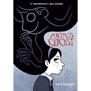
Anya's Ghost
Back in 2002 at San Diego Comic-con, I met a young artist called Vera Brosgol. Vera was a fan of my work, although when I saw her drawings, it was hard to tell why - as in her late teens she was already capable of better than anything I could manage. That she ended up working in the movies is no surprise.

And she did a few guest strips for me, back when I was a contender, all of which were superb! Check them out. In addition, Vera offered me a few nuggets of (frankly, violently blunt) advice four or five years ago that completely changed the way I drew and set me on a path of constant self-improvement. I'm never going to catch her up, but it's good to keep running towards that Russian dot on the horizon.
And at last, 9 years after that initial encounter, Vera's first graphic novel Anya's Ghost is about to drop (via the auspices of First Second Books). I've read it, it is superb.

So congratulations, Vera. You're sometimes right, sometimes wrong - but always certain.

And she did a few guest strips for me, back when I was a contender, all of which were superb! Check them out. In addition, Vera offered me a few nuggets of (frankly, violently blunt) advice four or five years ago that completely changed the way I drew and set me on a path of constant self-improvement. I'm never going to catch her up, but it's good to keep running towards that Russian dot on the horizon.
And at last, 9 years after that initial encounter, Vera's first graphic novel Anya's Ghost is about to drop (via the auspices of First Second Books). I've read it, it is superb.
So congratulations, Vera. You're sometimes right, sometimes wrong - but always certain.
Tuesday, May 03, 2011
Bug-eyed
I've been laying out The Case Of The Simple Soul for a little book that will hopefully be available at MCM Expo at the end of the month. Time is against me to an extent, but I'll try to have them ready. Looking over 94 of an eventual 98 completed pages (I still have 4 to draw), I noticed a couple of things:
1. Apparently I was keen to fill every square inch with as much detail as possible. In black and white (as these convention-special collections are), the pages suddently look very, very dense. No wonder I'm so tired, I've been drawing these loony-looking pages for 26 weeks straight!
2. This story is probably quite a lot better than the two that preceded it.
Still no news about proper published colour collections I'm afraid. As discussed ad nauseam, I could put them out myself tomorrow, but I've been doing that for eight years, I think I can make better books and reach a lot more people with the right help. That help has, thus far, been harder than expected to find - but I hope to get there. Several of my friends have offered kind assistance along the way.

I also want to link to a great blog, Alison Sampson's 'Space In Text' - it's a hugely thorough round-up of very strong illustration by someone with an excellent eye for it. A great place to go for inspiration or just to feel better about this dang ol' world.
Monday, May 02, 2011
In absentia
This week's comics constitute the penultimate week of "The Case Of The Simple Soul". After next week, I've lined up five guest comics which will hopefully a. inform, b. entertain and c. delight you. I have also cooked up a daily sideshow event to the guest strips, an experiment that worked well enough to cast the cold light of day upon. The week after guest week, I will be living for pleasure alone. I'm not sure what I'm going to draw, but I'm not desperate to start another 100 page story immediately. So whatever it is should offer a quick hit of, and I choose my words carefully here, untrammelled excellence.
(Due to the fact that I work a week ahead, next week I will actually be on my holidays, collecting brass-rubbings in the crypts of East Anglia.)

In the remainder of May, you will be able to see me, alive and enervated, at the MCM Expo at London Docklands (May 27-29). More on that later in the month.
Sunday, May 01, 2011
On this day in history
 I was looking back through some old guest strips and found the folder for my 2008 "Feats Of Strength" competition. Here it is! I can't believe the standard of the entries. The winner by Lissa Treiman (left) was amazing, I still remember being blown away when I received it.
 Where is she now? Oh yes, working at Disney. It all worked out.
A week or so ago I asked for submissions for a similar fill-in week, but I didn't go about it in the right way. Bar one, I couldn't really tell from most of the people who wrote to me whether they would be able to make something that made sense as a fill-in for me. Earnest offers were made but I wasn't sure what I was looking at. I'll work out a proper reader submission thing later in the year, in the spirit of past events.
Thursday, April 28, 2011
"Sorry to have kept you waiting"
I haven't been to the supermarket lately, or rather, when I have, I've used the self check-out. But today I used a normal checkout. There was a short queue, it was busy. And as each person reached the cashier, she said "sorry to have kept you waiting". As she had doubtless been told to do.
CORPORATE OVERLORDS, LISTEN TO ME.
If you wish to imbue the grocery shopping experience with something approaching courtesy and grace, do not inform your members of staff to robotically repeat the same phrases, unless you wish to create - and I suggest you note this down - the impression that the cashier hates each and every customer. Nothing says "I'm not sorry" better than the exact circumstances you have created.
The self-checkout is a kind of robot. It generally works well. But that doesn't mean you should extend the brand values of this worthy automaton to your entire workforce, particularly - and I suggest you also note this down - the customer-facing part of your operation. Believe it or not, human beings can tell when human beings are behaving inauthentically.
I have finished now.
Tuesday, April 26, 2011
My tempestuous past
Few are aware of my spell in the mid-90s as a "hot" artist. Profiled for Wizard magazine, I was described as "the new Whilce Portacio", in an article that memorably warned, "watch out, Trent Kaniuga!"
Hired to create an incendiary new spin on Miss Marvel by incoming ed-in-chief Bob Harras, I was run out of town on a rail when I submitted my first pages. Harras, a strong man when riled, picked me up by my coat collar and cast me into the New York foot traffic, where I was trampled for some minutes. I was so badly damaged by the shoes of the disinterested locals that when I returned, with "Bobbins", in 1998, it appeared that I could barely draw at all.
Little of this formative work remains intact, due to the rending it received in editorial hands, but here's a panel that shows you how my "no fighting, no crossovers" technique might have revolutionised the industry. Enjoy!

Sunday, April 24, 2011
Man versus machine versus competence
I'm always tinkering with the way I work to see if I can do better. Working purely digitally has vastly improved the finished standard of my comics, as I was never a great draughtsman and my composition was weak when I started working that way. But there are downsides to it - I have no originals to sell (an important part of many cartoonists' income), and I have to rely on a lot of expensive equipment. The trade-offs are worth it in terms of time saved and the knowledge that errors made in ink aren't fatal (the latter took a lot of stiffness out of how I draw, on or off the computer).
But I thought I'd have a go at inking some of my Manga Studio "pencils" traditionally and the results were very interesting!
I made a "blueline" out of my Manga studio page and printed it out at A3 portrait size (about 29cm high). I probably made it a bit pale, which created a few extra problems.

I had a go at inking with a Sailor variable-width nib fountain pen and a 0.3 graphic pen.
Now, bearing in mind that I had printed the panels out at twice the height and width I used to draw them at in the old pen and ink days; it was very hard to achieve the accuracy and detail I get on the Cintiq, and I mangled a lot of details on the first page I tried. The page was full of tiny figures that I suppose I have become very used to zooming in on to ink on-screen. I had no idea. I'm not sure that I could have accurately finished their features with a pin, let alone a pen.

I pretty much got to grips with this panel, but I was very aware as I worked on it that I couldn't really do any decision-making as I inked, something I've got very used to. It's not like I spend my time deleting a lot of things and re-doing them (inks only take me about an hour) but I really felt like I was missing things as I went around. Probably because I could barely see what I was doing.

This is the original panel as-was. If you compare this to the pencils and my quick inked version, you can see how much of the final brain-work is done in this stage.
Neither of these techniques is a panacea. I enjoy the level of precise-ness I can achieve with the computer, but I can never achieve the spontaneous, exciting shapes I can get with ease using traditional means. All those precise tiny lines come after I do the hard work of composition with a pencil and paper in thumbnails. It's just a style that does a job on the sort of comics I do. If I'm trying to make a point here, it's that once you've mastered the basics, just do whatever works best. But try to keep your hand in with everything.

Friday, April 22, 2011
Take A Break
At the end of this current story (from Monday May 16th) Bad Machinery will be taking a break for a couple of weeks. For the first week I'll be on holiday, for the second week I'll be doing pages every day but not my standard comics, I'm going to draw whatever I fancy at the time. At the end of this two-week festival of messing about, I will return to my normal duties with a new Bad Machinery case.
During "holiday week", there will be nothing to entertain you but the sound of breeze through the twigs. I'd like to showcase exclusively newer, less well-known (to me at least) comic artists as I did Rebecca Head, Jamie Littler and Emily Ryan during the last guest fortnight.
If you think you're up to that standard (or failing that, the John Allison standard) and you fancy doing a Bad Machinery comic page, drop me an email at john@scarygoround.com with the subject line "Better Than The Breeze Through The Twigs", let me know what you are all about, and we can see if I've got a slot for you. Please don't send any finished artwork unless you are fantastically, precociously brilliant.
Thursday, April 21, 2011
Erin watercolour
In response to demand for the last batch of watercolours, I just did another one. Just one mind, I'm not exactly spoiling you. As before, to prevent a spate of refunds, it's available first-come first-served by email reservation. £32.50 including shipping.
Email scaryorders@gmail.com with "watercolour reservation" as your subject line and let me know which picture(s) you would like. I'll then direct you to the payment page. If you haven't paid within 24 hours of my sending you to the payment page, I'll cancel the reservation and put the pic back on sale - easy!
Erin (21 x 25cm, on 300gsm/140lb watercolour board) SOLD!

Email scaryorders@gmail.com with "watercolour reservation" as your subject line and let me know which picture(s) you would like. I'll then direct you to the payment page. If you haven't paid within 24 hours of my sending you to the payment page, I'll cancel the reservation and put the pic back on sale - easy!

Tuesday, April 12, 2011
Owl Desk
Important news from the owl desk; I've got this to you as fast as I can manage. Hot off the press, you might say!


Monday, April 11, 2011
"Fun" for Cintiq owners
The reason I bought my original Cintiq in 2007 was to use to use Manga Studio. Despite 7 years' prior daily use of a "trad" Wacom tablet, I couldn't master freehand drawing with it. The disconnect of eye and hand as you watch the cursor the screen was too much. I was far from accurate, and my shoulder would tense up in agony as I attempted pass after undone pass at long strokes.
I had a go at drawing with that same old Wacom tablet this evening as I had been using it for another job. And strangely, after years of using the Cintiq, I could now draw far more accurately than I could back in 2007. While I would never use an Intuos for all my daily drawing by choice (if the Cintiq broke and I couldn't replace it, I'd probably go back to pen and paper), I couldn't believe how much had improved.
Here's a little sketch I did, it wasn't as fluent as working on the Cintiq, but I got the sense that after a few weeks practice, I could probably get perfectly used to it.
I wonder if any other Cintiq users have had the same experience when they dug out their old tablet?

Thursday, April 07, 2011
Bad Machinery wallpapers
It's nearly two years to the day since I registered badmachinery.com and got to work on this new deal. So I've made some wallpapers. The different sizes are below!

[1024x768]
[1280x800]
[1440x900]
[1680x1050]

[1024x768]
![[1024x768]](http://scarygoround.com/wp/bm-wp1024.png)
[1280x800]
![[1280x800]](http://scarygoround.com/wp/bm-wp1280.png)
[1440x900]
![[1440x900]](http://scarygoround.com/wp/bm-wp1440.png)
[1680x1050]
![[1680x1050]](http://scarygoround.com/wp/bm-wp1680.png)
Monday, April 04, 2011
Janelle Monae
I quite like drawing Janelle Monae. She's one of the most compelling performers of our age. No one can sing and dance like she can. Her album didn't quite win me over but I am certain that there are great things to come from Ms. Monae.


Thursday, March 24, 2011
Foxhole
When I ended Scary Go Round, I promised a new Shelley Winters project, "Destroy History", would follow. Well, it didn't. I wrote about 13 pages, couldn't see how I could write the character any more (given the direction I'd taken her), tore up what I'd done (I write all my comics longhand, away from the computer) and let the destroyhistory.com domain name lapse.
But I still enjoy drawing Shelley, she's a reasonable piece of very long-term character design. And on Sunday I started, by accident, working on a new thing for her. It's a short story called "Fox Flakes". It's not really a comic, it's all in rhyme, and I'm not sure what to do with it to justify working it up into a finished form. I don't even know what form it would take! And it's not drawn like my normal comics. But if you miss Shelley, she might just come back.

But I still enjoy drawing Shelley, she's a reasonable piece of very long-term character design. And on Sunday I started, by accident, working on a new thing for her. It's a short story called "Fox Flakes". It's not really a comic, it's all in rhyme, and I'm not sure what to do with it to justify working it up into a finished form. I don't even know what form it would take! And it's not drawn like my normal comics. But if you miss Shelley, she might just come back.
Monday, March 21, 2011
Watercolour sale
I have five watercolour drawings (all on 300gsm/140lb watercolour board) left over from my two-city tour. To prevent a run on them and a spate of refunds, they will be available first-come first-served by email reservation. They're £32.50 each including shipping.
Email scaryorders@gmail.com with "watercolour reservation" as your subject line and let me know which picture(s) you would like. I'll then direct you to the payment page. If you haven't paid within 24 hours of my sending you to the payment page, I'll cancel the reservation and put the pic back on sale - easy!
Charlotte (21cm x 25cm) SOLD!

Daisy (21cm x 25cm) SOLD!
Shelley (21cm x 25cm) SOLD!

Esther (17cm x 25cm) SOLD!


Email scaryorders@gmail.com with "watercolour reservation" as your subject line and let me know which picture(s) you would like. I'll then direct you to the payment page. If you haven't paid within 24 hours of my sending you to the payment page, I'll cancel the reservation and put the pic back on sale - easy!


Susan (21cm x 25cm)

Sunday, March 20, 2011
Martin & Tracy
I received this leaflet through my door the other day, I thought you might like to see it. Something about it worries me.


Here's Martin, hard at work. No bubbles in that wallpaper, and he's wearing a button-down shirt, lending a confident, stylish air to proceedings.

And here's Tracy. Nice job with those tiles, Tracy. That's a wicked finish too - no chance of cracking.

WHO'S THIS? It's not Tracy, and it's certainly not Martin!
The whole situation just has me feeling a little ill at ease. Until I know who the third party is, I won't be calling on Martin & Tracy for any of my painting and decorating needs.
Your move, Martin & Tracy.
Friday, March 18, 2011
Forty drawings
Here are forty little drawings, give or take, drawn watching TV last night. Click for a better look!


Subscribe to:
Posts (Atom)